Bringing back the CSS Basics series today to talk about a really awesome element of web design – borders! It sounds kinda boring and it can be boring, or it can make all of the difference in your designs. I feel like I am always learning new things about borders and it really all comes from experimenting. If you’re not too familiar with CSS, take a look at our Intro to CSS Guide!
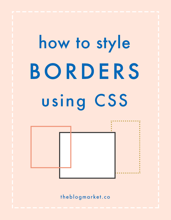
Here are a few simple ways you can style borders:
border: 1px solid #000;
example
border: 2px dotted #4a8d7b;
example
border: 3px dashed #d0b237;
example
border: 5px double #ffae93;
example
When styling borders, you can code everything into one line or separate lines. Whatever makes you feel most organized.
Example of one line:
.class-name {
border: 1px solid #444;
}
Example of separate lines:
.class-name {
border-width: 1px;
border-style: solid;
border-color: #444;
}
Sometimes I like to add outlines to objects. An outline will go outside of the border, causing it to appear as if there are two borders instead of one. I use this when I want to create buttons that look like they have inset borders (see the main page of my site, Earl Grey Creative).
To create an effect like this, use the following codes, adjusting the class name, padding, color codes and pixel width as you’d like:
.class-name {
background: #d0b237;
padding: 20px 40px;
border: 1px solid #fff;
outline: 5px solid #d0b237;
}
It will end up looking like this:
BUTTON!
Does that all make sense? Let me know if you have any questions! If you want to make changes to your site but don’t want to bother with coding, get in touch! I’m available to make theme customizations at an hourly rate.