Since earlier this year, I’ve worked with several clients who wanted gold foil text, which I’m fully in support of. Like I mentioned in this post a couple weeks ago, adding texture to your blog or website design is a simple but effective way to make it stand out. Normally when adding textured elements, particularly gold text, I use a clipping mask or type mask in Photoshop (view my past tutorials here and here). However, I recently discovered that you can add a background image to your text using CSS! Seriously life changing.
There are several reasons why I think this is amazing. First of all, you don’t have to upload images in place of text. Some fonts are fuzzier than others even when uploaded as a png and that can be really frustrating. Second, your site will be much more SEO friendly when you use text instead of images. Overall I think it just looks way cleaner than creating tiny text graphics in Photoshop. And it’s less time consuming which is also a plus.
Alright! I’m going to teach you how to make a simple line of gold text with CSS, but you can use any background image, pattern, etc. (If you need a CSS refresher, read my intro to CSS post first). I’ll be sharing how to do this with WordPress, but other platforms are very similar. Also, keep in mind that this type of code doesn’t work for certain browsers like Internet Explorer so make sure you’re viewing this post in Chrome or Safari.
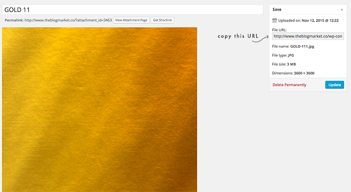
1. First, find a gold texture to use (or any image at all). The one I’m using was purchased from La Motte Design on Etsy. Upload your image to the media library of your website and keep the file URL handy.
2. Create a paragraph using HTML and add it to your page or widget. Add a CSS class to this paragraph using the following format. We’re going to call our class gold-text.
<p class=”gold-text”>The Blog Market</p>
3. Next, go to your CSS Editor and copy & paste the following code but replace https://theblogmarket.co/gold-texture-image.png with the direct URL to your own image.
.gold-text {
color:#c3a343;
-webkit-text-fill-color: transparent;
background: -webkit-linear-gradient(transparent, transparent),
url(https://theblogmarket.co/gold-texture-image.png) repeat;
background: -o-linear-gradient(transparent, transparent);
-webkit-background-clip: text;
}
An alternative method is to use inline CSS, which looks like this:
<p style=”color:#c3a343; -webkit-text-fill-color: transparent; background: -webkit-linear-gradient(transparent, transparent), url(https://theblogmarket.co/gold-texture-image.png) repeat; background: -o-linear-gradient(transparent, transparent); -webkit-background-clip: text;”>YOUR TEXT HERE</p>
You can copy and paste the HTML code above into any page or widget. You can also see that I included a fallback color #c3a343, which will be a dark goldenrod. So if someone is visiting my site from Internet Explorer or another unsupported browser, they’ll still be able to see the text even if it’s not gold foil.
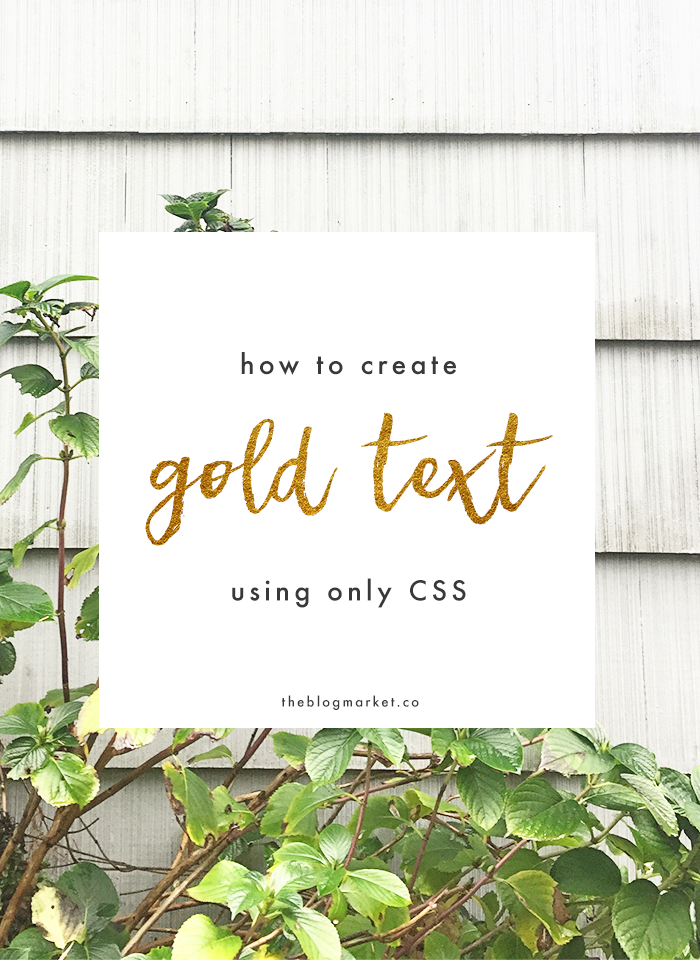
Here is what it looks like in action:
the blog market
Pretty, huh? Instead of using a gold texture, I’d love to try this with a marble or floral pattern. So many options.
Have fun with this tutorial and let me know if you have questions!


Gina says
Such an awesome way to make text stand out! Love this CSS trick – I should use it more often!
Brittni says
What an awesome trick! Using CSS to render type is always more ideal than using pngs (especially in today’s age of retina displays), so this is the perfect way to get Photoshop style effects on the web. Great point on adding a similar fallback color for older browsers – as much as we all wish for IE to go away forever, that’s sadly not the case (yet)!
Jennifer says
Thanks Brittni! I love using CSS any chance I can get! It’s crazy that graphics appear so differently from screen to screen nowadays. And I feel the exact same way about IE. Why is it still a thing?!
Naushin says
Genius! I’m just starting to design custom WordPress templates and I was just thinking about this the other day! Your blog is awesome. It popped up in my Pinterest feed and now I’m obsessed. Thanks for all of the great, easy to implement, practical advice!
Jennifer says
Aw, thanks Naushin! So happy you’re here! :)
Lynece says
This is exactly what I have been wanting! Would this for for the header for a website? Also could you change the style of font?
Jennifer says
Yes! As long as your header is text only (rather than an image) you would be able to add the gold foil overlay. And yes, you can also change the style of the font with basic CSS. Send us an email if you have any other questions: https://www.theblogmarket.co/contact/ :)
Larry says
Hi Jennifer, Thank you vary much for this technique!
Do you know how to code this for Mozilla Firefox? All that shows in FireFox is the color only.
Thanks, Larry
Alyssa says
Hi Larry!
You should be able to use -moz prefix (duplicate the lines with -webkit and -o). So, something like this:
-webkit-text-fill-color: transparent;
background: -webkit-linear-gradient(transparent, transparent),
url(https://theblogmarket.co/gold-texture-image.png) repeat;
background: -o-linear-gradient(transparent, transparent);
-webkit-background-clip: text;
-moz-text-fill-color: transparent;
background: -moz-linear-gradient(transparent, transparent), url(”) repeat;
-webkit-background-clip: text;
Bob Kruse says
This is so cool! I’ve already been doing something like this for the backgrounds of things like navigation bars and side bars on my sites, but I never knew you could do it for text!
Katie says
none of these work for me , it just creates #000 text and #fff background…
Jennifer says
Sorry it’s giving you trouble! Email me at jennifer@earlgreycreative for extra help. :)