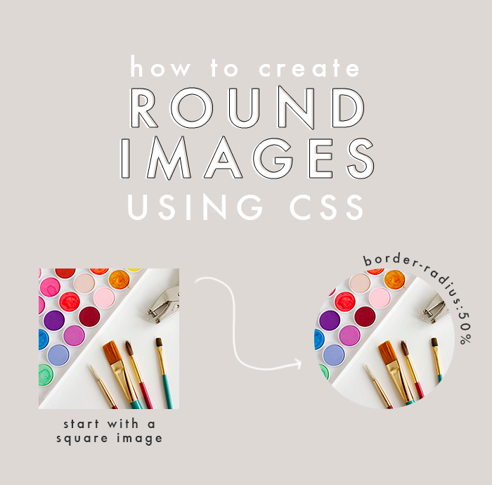
Making images round is the perfect way to add a little somethin’ to a blog design. Usually I use Photoshop, but it can also easily be done using CSS. This comes in handy if you don’t have Photoshop or if you change your mind a lot when it comes to image styles.
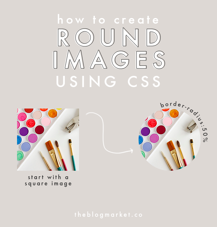
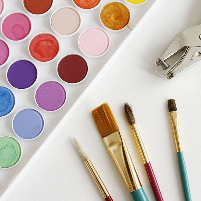
If you want a completely round image, you’ll need to start with a square shaped photo.
There are a couple different ways you can add your CSS codes. You can add it straight to your HTML tag which will look like this:
<img style=”border-radius:50%;” src=”http://yourimageurl.jpg”>
Another option is to add a class to your image, then add the CSS in your designated CSS editor. This is a good option if you need to edit the style of multiple elements. Here’s what that would look like:
<img class=”round-image” src=”http://yourimageurl.jpg”>
Then you would go into your CSS editor and add the following code:
.round-image {
border-radius: 50%;
}
For this tutorial, I used option #1 and added the CSS directly to my HTML image tag. Here is the result:
You can also use the border-radius property to add subtle rounded edges to any image or element. Instead of border-radius:50%; you might try 10%, creating something like this:
The border-radius property can be used on other elements too, not just images. It looks great when used with sidebars, date headers, and category labels. Let me know if you have any questions!


Sarah says
So neat! I’m really looking forward to learning more CSS in 2015 :)
Mitch says
What a great tutorial! round images are crazy popular on blogs, and honestly, I love how they look. Thanks for sharing. I didn’t realize you could do that directly in the CSS rather than editing the image. certainly makes things easier.
Happy New Year!
Mitch
kate says
this was perfect! just (successfully!) used this, thanks so much.
i did it using the CSS class which was my first time EVER playing around with that, can’t wait to learn more!
Dora says
It works like a charm! I’m so glad I found your website!
I am looking forward to learning and exploring CSS more :)