You already know how we feel about Google web fonts – we love them. They’re free, easy to install, and the styles and options go on for days. I’ve got to admit I’m really into sans-serif fonts and not so much into serif. Serif seems too serious for me. But then sometimes brands and websites call for more a professional, classic feel. I’ve found that adding a serif font to the mix can really bring the whole concept together. To learn about the difference between serif and sans-serif fonts, check out this detailed infographic. And if you’re not familiar with web fonts, read my web fonts 101 post first!
This week I scoped out serif fonts and surprisingly ended up loving a lot of them. The following fonts are especially nice as body fonts in a blog design. They’re unique and still easy on the eyes. Win-win.
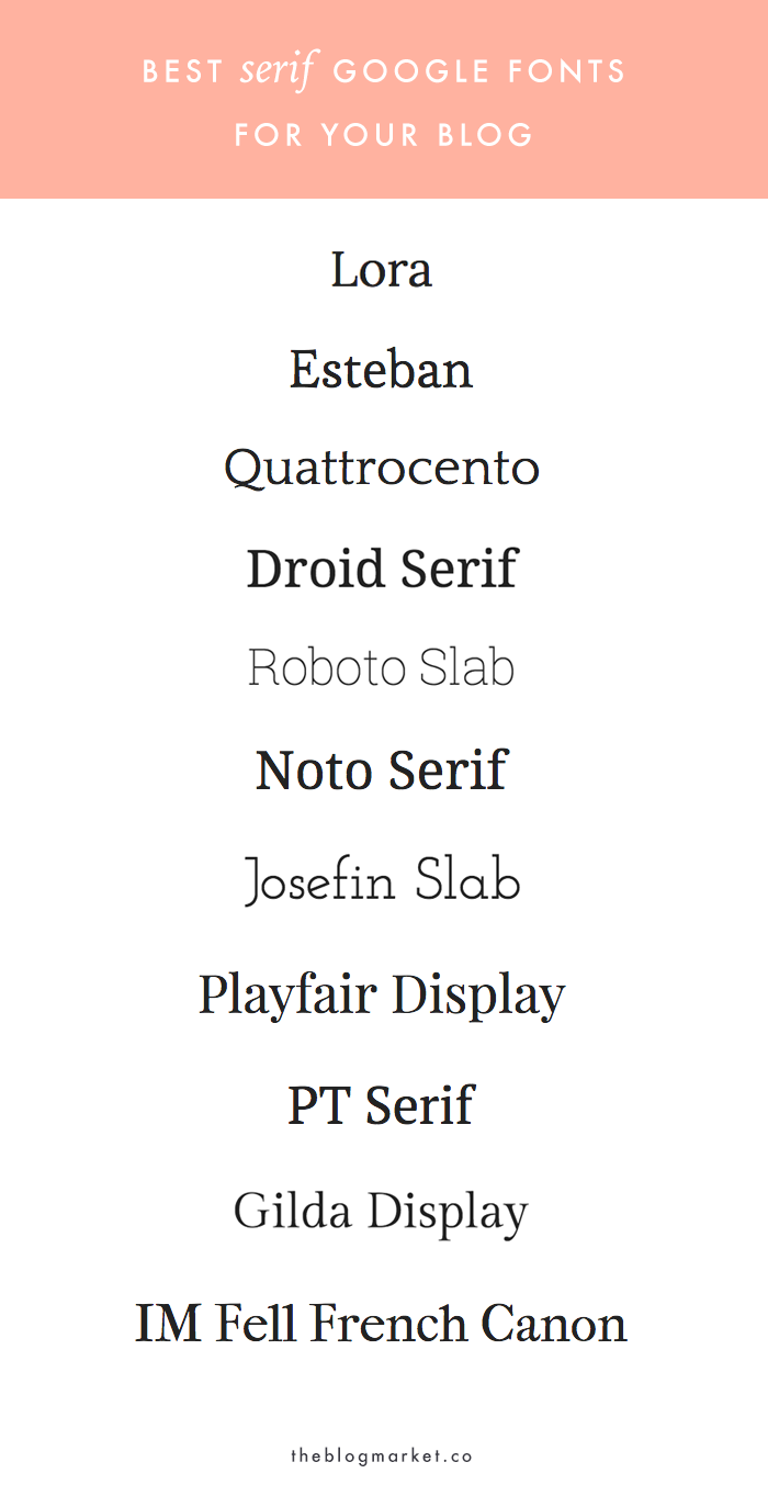
1. Lora
2. Esteban
3. Quattrocento
4. Droid Serif
5. Roboto Slab
6. Noto Serif
7. Josefin Slab
8. Playfair Display
9. PT Serif
10. Gilda Display
11. IM Fell French Canon
Are you a fan of serif fonts, sans serif fonts, or both? Is Google your go-to spot for web fonts? We also use Adobe Typekit and have found tons of great options there. Happy font scouting!


Audrey | Brunch at Audrey's says
Playfair is one of my FAVOURITES!! I like using it more for headings than bodies :) -Audrey | Brunch at Audrey’s
Angela says
I love Playfair too! I love how it looks in graphics!
Christine says
Josefin Slab is my favorite! I had it on my blog for a while. Great post. I’m learning to love serif fonts again.