When I think back to when I started blogging, I remember a time when photos were good to have but they were by no means required to be professional quality or even edited. When it came to blogging graphics, like collages or images with text overlays, they were these thrown together inspiration boards that didn’t need to have a “brand”. A lot has changed! Part of me finds that a little frustrating as a writer–sometimes you really want your blog post to be all about the written contrast–and part of my is up for the challenge, since I love learning photography and design. Graphics are everything, but that’s not to say you have to follow any one rule for creating an awesome image. We think you can do whatever you want, but you just have to be intentional about it. And of course, it helps if you have an eye for design!
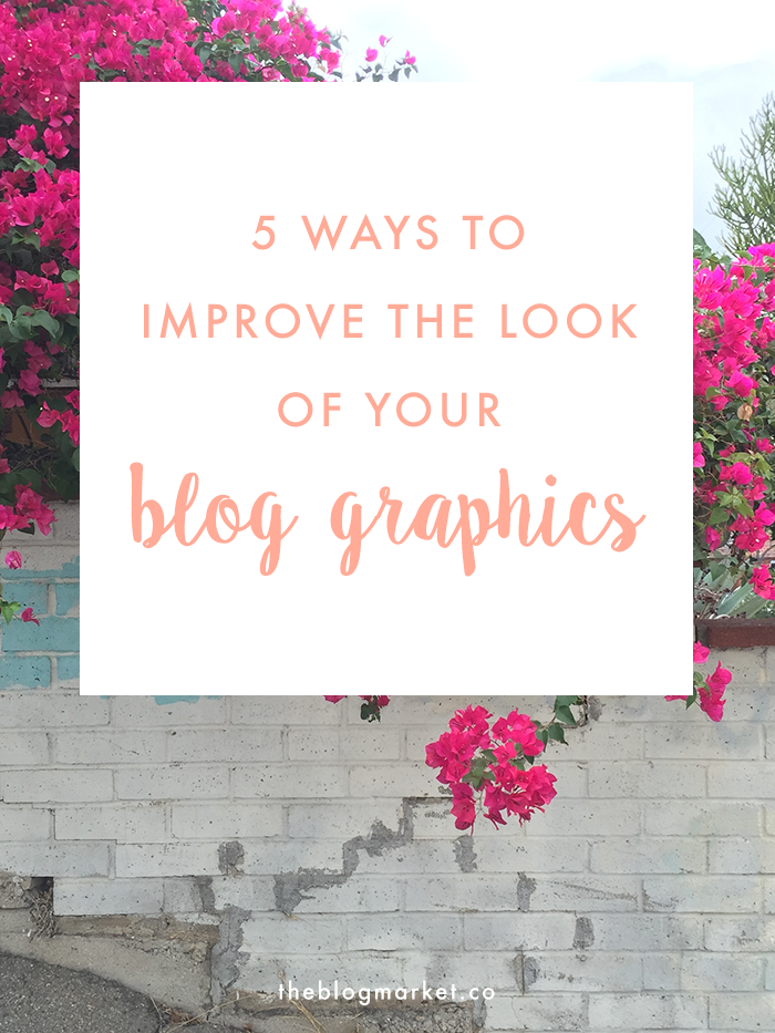
5 Ways to Improve the Look of Your Blog Graphics
1. Learn a thing or two about Photoshop. I don’t know anyone who regrets having learned Photoshop so if you’re in it for real, it’s a good skill to add to the resume! The only thing you have to lose with Photoshop is money (and you can buy a subscription instead of investing upfront). You’ll have a lot more creative freedom with images and blog graphics with Photoshop. You’ll also be able to create templates to use to ensure that each blog post that needs it actually ends up with the same size fonts, placements, etc.
2. Value creativity as much as consistency. You may have noticed that we’ve uploaded quite a few different looking graphics. Even though it took time to get in a groove–like it does with all blogs–we quickly found the things we wanted to be consistent with, and the things we wanted to be creative with. For example, we love to be consistent with fonts and overlays (either a box around text or some minimal way of highlighting the title), and include our watermark in a non-invasive way. But for the graphic itself, we love to try out new images. We don’t want all our blog posts to look the same. Totally understand why people might, it’s easier and certainly does make you recognizable, but to us it’s more important to feel like we’re creating something new with each post. Plus, I just take a lot of images! It’s nice to give them a home. So our advice is to choose things that are consistent, and play around with the others.
3. We like things clean around here. Messy graphics stress us out a bit as readers, so we don’t want to do that to ours. Though we do see why some people like a more involved style. It’s really up to you as a blogger. I’ll never get when designers have super cluttered images, because being user friendly is pretty important, but at the same time, I can see not wanting to be boring. So, focus on a few things you maybe want to make more original, like a font or color scheme, and try to keep the rest clean in order to have a clear message.
4. Don’t take photos if it’s not your strong suit. Jennifer and I don’t like to use stock photos (even the nice free ones) because we both have invested in nice photography equipment and taking photos is fun for us. But if your blog is strongly focused on written content (which like I said above, I 100% get), I don’t suggest pretending you’re something you’re not. Despite what the pros seem to say, I’ve seen plenty of text-focused blogs that attract readers and there are plenty of ways to get around this without completely abandoning the visual aspect of a blog. Stock photos are one option. I definitely recommend more creative, artist-supported sites like StockSnap + Twenty20 (check out my friend Charity’s photos). But if you’re going that route, scroll through bloglovin’ and Pinterest occasionally to make sure they’re not already on 500 blogs. You can also create your own graphics that aren’t image-based. But whatever you do, don’t just upload a low quality image just because someone told you you have to learn photography to blog!
5. Save and step back. For me creating blog images is one of the many ways I have to deal with design indecision. I’m so indecisive when it comes to fonts and graphics, so when I wanted to update the look of my images on IFM recently, I went through some old posts, looked at some new posts, and created about six images with my new fonts and filters, before uploading a single one. Then I waited until the next day to make the change. It helps so much to take a tiny step back and gain clarity!
Hope these helped anyone updating their images this upcoming month!


Kaitlyn says
I love this! Consistency (to some extent) is key in making your brand recognizable, so learning how to use graphics and elements within your graphics to be consistent will only help you! I love the way y’alls graphics look :)
– Kaitlyn | http://www.TheCrownFox.com
Angela says
Thanks Kaitlyn!
mika says
Thanks so much for these tips! I definitely agree about the cluttered images!
xoxo
http://www.hellohimawari.com/
Sara Ricks says
I love the comment about taking a step back to gain clarity! I learned this little trick when posting my blog posts and it has helped me in editing my content so much. This advice can be used in so many different facets.
Angela says
I feel like I’m always suggesting that no matter what. So many things in life would benefit from taking a step back, especially when you’re working tirelessly on a project. It really helps – so great to hear it’s what you do with editing! :)
Chloe says
I reall, really love the cleanness of this blog. I try to keep mine as tidy as possible too, but I must say, I often fall into the trap of using stock photos. I tried using Photoshop at uni and it was a nightmare. I really think I need to watch some tutorials and give it another go! Originality is key!
Angela says
It definitely takes time – It honestly took me years to learn what I know about Photoshop and I still have SO much to learn! But it has definitely been worth it.
Laura says
Some very worthwhile tips! Thank you for this – I will be referring back to it often, I’m sure. Photography is my strength, but I really struggle when it comes to design.
– Laura
http://eggshelldays.blogspot.co.uk/
Angela says
Totally know what you mean. I feel more comfortable taking the photo. It’s nice because whenever I’m not exactly sure of text placement or fonts I just email Jenn, she’s better with the design :)
Doris says
I am fairly new to blogging and not sure about graphics. My question- Do most bloggers use Word + Photoshop to complete their posts? Does this mean they used a pdf file and uploaded the file?
I have been using Word Press as my editor and I’m not able to add plugins, etc.
What do you suggest for me. Please take a look at my site and give me some feedback. I welcome anyone leaving comments. Thanks! Doris
Angela says
For photos, many bloggers use Photoshop, but it’s a big investment and if you’re new to working with graphics or images, you probably want to get comfortable with free photo editors like PicMonkey and Picasa first. I use Word to type my post, then copy it over to WordPress, I don’t upload. It doesn’t have to be Word, but I think it’s always a good idea to type it up somewhere other than the editor first. It allows you to easily save drafts of your posts, and you’ll be more likely to see typos or errors when copying it over. That’s personally just my way, a lot of people type it right in the editor too. Hope that helps!
Bri says
Thanks for sharing! Great post!